
Big platforms feel simple when guidance arrives at the exact moment a decision is made. A short, readable hint that uses the same words as the interface and disappears once learned. When teams treat help as part of the build, users move faster, support stays quiet, and releases land with fewer surprises.
Good guidance is a system, not a paragraph. It lives beside the control, updates with the code, and shows proof on the same screen where the action occurs. The result is confidence under pressure rather than guesswork.
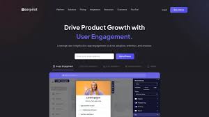
Put the help where the tap happens
Context beats instruction every time. The most useful micro-guides sit under the button or tile they explain and answer one question at a time. Many teams keep a compact internal handbook that pairs UI labels with approved copy and tiny examples – the pattern matches the practical playbooks outlined on this website, so designers and writers ship the explanation with the feature, not after it. Users absorb the hint without leaving the flow because the interface and the words tell the same story. Research on progressive disclosure backs this approach by reducing cognitive load until depth is actually needed.
Clear language is the second half of context. Labels use short verbs that state outcomes. Micro-copy names the next checkpoint in plain English. People act quickly when meaning arrives before math.
Treat docs like code so they never go stale
Static helps age faster. A durable system version copy, examples, and icons in the same repository as the feature. Each build carries its own micro-docs, which means rollbacks also restore the matching words. The “docs as code” philosophy keeps writers inside the delivery pipeline – issues, reviews, and automated checks – so guidance ships when the feature ships and stays accurate across variants.
Feature flags apply to help as well. If a layout rolls out to a slice of users, only that cohort sees the new hints. Everyone else keeps the previous set. Patch notes can reference the exact cards that changed, turning release comms into visible on-screen proof rather than marketing gloss.
Make cards readable in a blink
People skim during live moments. Design choices can cut misreads without adding noise.
- Use short, literal labels. Avoid metaphors that take a second to decode.
- Keep numerals distinct and give lines room to breathe so six, eight, and nine never blur on small screens.
- Pair color with shape or badges so the state survives low contrast and color-blind conditions.
- Let text reflow when users increase font size. Do not truncate key labels.
- Prefer a single soft pulse to mark an update over heavy animation.
These moves align with accessibility guidance on reflow and contrast. They help everyone by keeping information legible in bright sun, on older phones, and with larger text enabled.
Teach by showing, not by telling
Definitions rarely calm anyone. Tiny, local examples change behavior. A micro-guide that shows a before-and-after snapshot beside the control – stake preset applied, timer started, state locked – builds pattern recognition fast. Good cards follow a steady rhythm: name the control, state what changes after the tap, hint where the update will appear, and show one compact example with tidy numbers. That structure respects attention while still giving newcomers a foothold.
This is where editorial guardrails help. Progressive disclosure keeps advanced details behind a small affordance until they matter, which prevents clutter and measurably reduces errors in forms and dense screens.
Measure comprehension, then rewrite
Data edit GIS real guidance. Instrument the first minutes of each journey for time-to-first-action and re-tap rate on critical controls. If a card does not move those numbers, change it and ship the new text with the next build. Release notes are displayed alongside the updated control, using the same nouns as the UI. Teams that iterate this way turn vague tips into crisp, trustworthy cues within a couple of sprints.
Closing the loop matters for accessibility, too. Track how often larger text or reduced motion is active and verify that cards still scan cleanly for those users. When readability holds, error rates fall because meaning stays visible under pressure.
A steady voice users learn to trust
The strongest platforms make guidance feel like part of the interface. Put help where the tap happens. Version words with the code. Keep cards scannable and considerate of various users and devices. Teach with tiny, real examples. Use a short checklist to align what the user sees with what the ledger will say. Measure understanding, then trim again. Follow this workflow and knowledge ships with the product – a quiet voice that keeps decisions calm, releases smooth, and evenings on schedule.